Enfamil website redesign
Helping new parents navigate feeding their baby through a personalized experience and conversational interface
E-commerce • Design system • 2019-2020
Activities
User research & testing
Strategy
Information architecture
Wireframing
Prototyping
Outcome
Delivery of 12 page templates, and a design system with over 80 reusable components
Enfamil.com relaunched in 2020.
Creative team @Huge
Sarah Stenseng - UX Lead
Adam Morris - Design Director
Katie Samour - Sr Visual Designer
Corey Vogel - Copywriter
Emily Wengert - Group VP, UX
Chloe Wong - Sr Art Director
Ziqu Zou - Sr Product Designer
The Ask
Transform Enfamil.com into an individualized digital destination where parents can learn and shop - driving engagement with the brand.
Enfamil, a top baby formula manufacturer, wanted to bring to life their mission of giving every baby the best start, respecting parents’ ability to make choices for themselves and for their child. The primary business objective was to drive engagement with the brand, with sign-up for their free samples / loyalty program being a key metric.
Role & process
As Experience Design lead, I drove UX activities for the full engagement, encompassing user research, strategic vision and concepting, and detailed design.
I oversaw a small experience design team from immersion to final hand-off, while also being hands on in the work. During immersion, I led user research synthesis and established our experience strategy and principles. During detailed design, I created a new information architecture, detailed wireframes, and interactive prototypes for usability testing. I also partnered with our product manager on strategic sprint briefs and personalization documentation.
01
Uncovering the opportunity
To determine the greatest value the website could provide to users, we needed to dig deeper into the needs and painpoints of new parents and caregivers. As part of our Immersion phase, we interviewed 14 parents currently using formula to feed their child.

PARENTS' PAINPOINTS
Most expecting parents don’t plan to use formula, but if things don’t go according to plan they face a stressful knowledge gap.
Parents turn to formula for a number of reasons, including breastfeeding challenges or work demands. Yet, for most, the default plan was to breastfeed, and they lack information about formula even as a back-up plan.
Differences between formulas aren’t clear.
Comparison between formula types can be confusing to parents who want to make sure a variation has all the necessary nutrients. Recommendations, samples and “trial and error” play a big role in the process.
The journey is fraught with emotion, vulnerability, and an ever-changing set of unknowns.
Parents are constantly making decisions while sleep deprived and short on time. They can feel judged and shamed by others, especially for decisions about feeding their baby.
our challenge
How might Enfamil.com act as an empowering resource: one that intelligently focuses options, while connecting parents to trusted expertise?
We learned from research that parents sought guidance from multiple sources including medical, familial, social networks, newsletters, apps, and digital content. They most valued timely advice aligned with upcoming milestones, and found reassurance via other parents’ anecdotes.
The previous site had a starting point for blending content and commerce, with nutrition and development focused articles comprising 22% of page views. However, the site was difficult to navigate, with a complex set of pathways and duplicative pages, placing the burden on users to sift through information.
Strategy & experience Principles
“Small” talk just for you
Through conversational UI and bite-sized content tailored to each parent, the websites strives to let users get back to fueling the most important person in the world: their baby. Four principles drove our design and features ideas for the site:
Make it personal.
Help parents find the right answers and anticipate what’s coming next in their journey.
Say more with less.
Help parents deal with information overload with highly impactful content that builds their knowledge.
Support on any path.
Provide empathy and empowerment so they can choose their own journey and not feel pressure or that there’s one right answer.
Offer reassurance when needed.
Ensure they don’t feel alone and lighten their emotional load through tone, humor, and moments of delight.
02
The new Enfamil.com
We challenged ourselves to design a mobile-first experience (as mobile made up 85% of visits) that a busy parent could use on their phone with one hand, while holding their baby in the other. The site delivers on our strategy and experience principles through:
- Interactive, conversational tools that anticipate parents’ questions
- Educational pages and features that make important information easy to take in
- Modular design and personalization logic that delivers more value the better we know each user
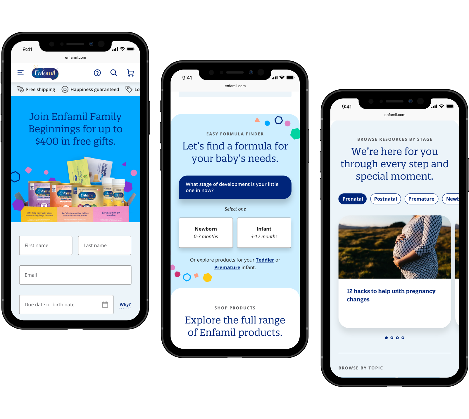
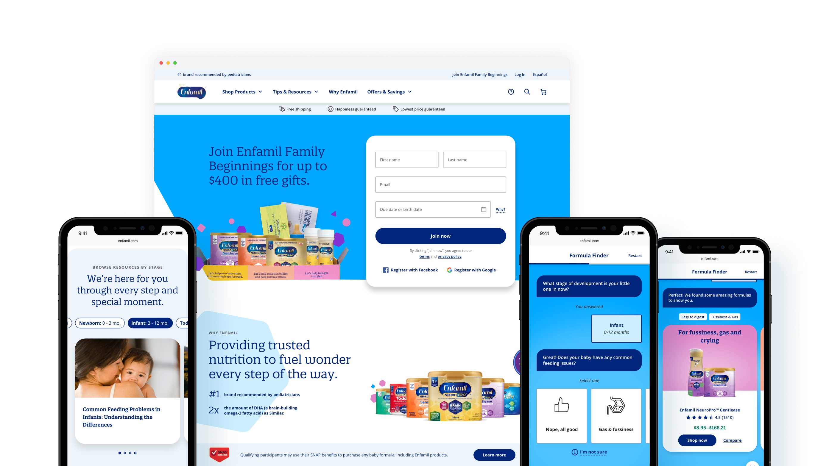
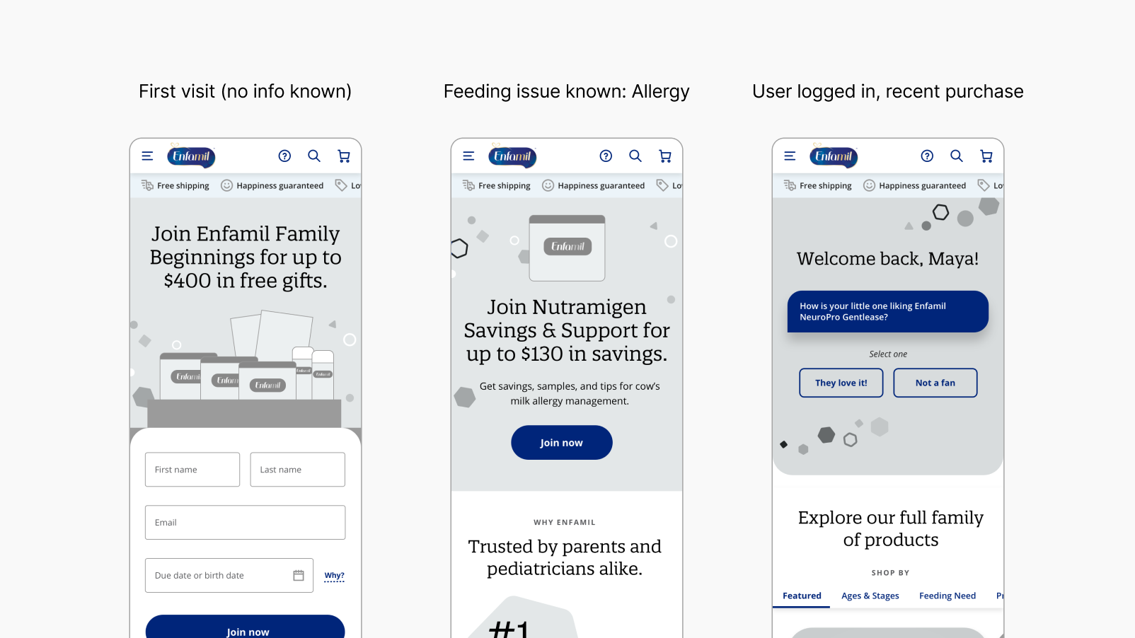
Homepage: New users
A guided introduction to Enfamil’s offerings
For new users, we crafted the homepage to showcase Enfamil's offerings and guide them to useful resources like the “formula finder”. The hero section promotes sign-ups for free samples through the Enfamil Family Beginnings program, a key business metric and an important way that many parents decide on a formula type.
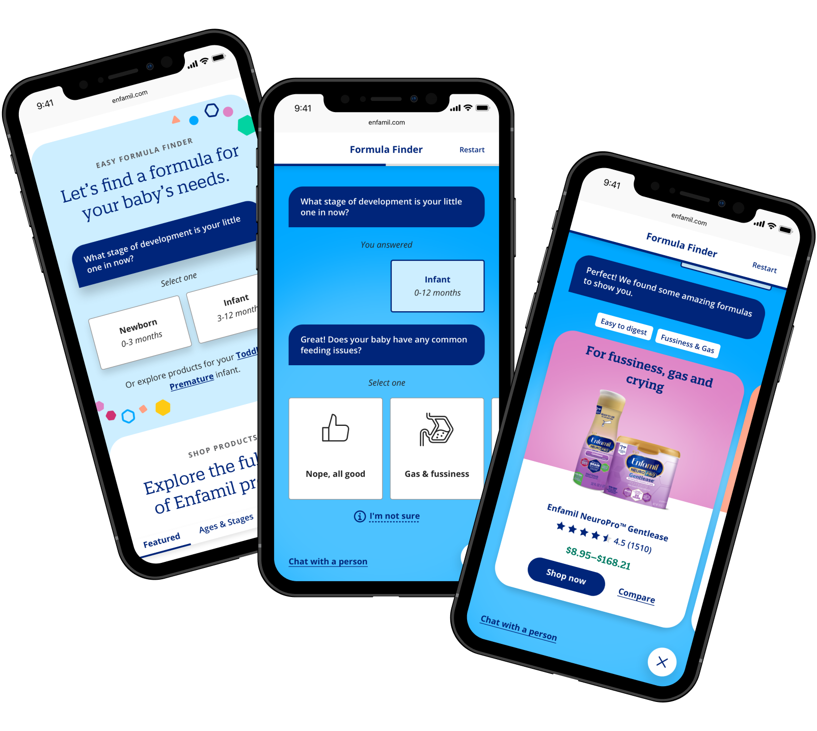
Formula finder
Helping parents identify the right formula for their child
To identify what formula may be best for their child, we designed a tool that recommends options based on parents’ responses to four questions. The recommendations emphasize the formula’s main use case (e.g. Fussiness) vs it’s official product name.
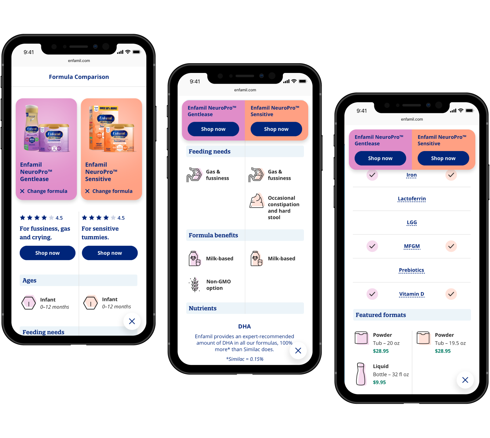
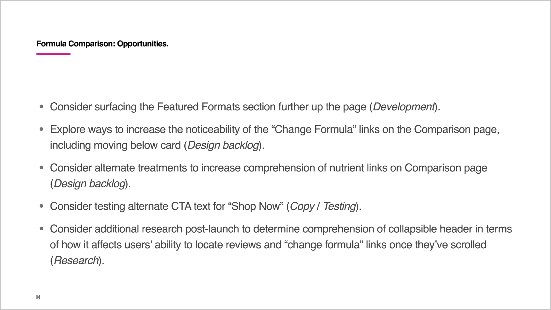
Formula comparison
Conveying the differences between formulas at-a-glance
We designed a simple and straightforward comparison page to convey differences between formulas, a painpoint identified in research. Users can select specific formulas and scroll to compare benefits, nutrients, formats, and pricing.
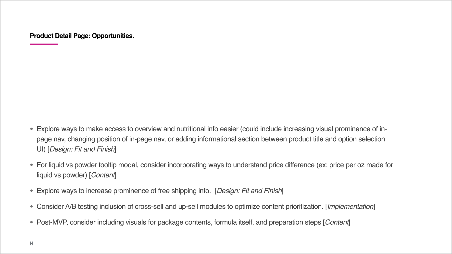
Product detail
Educating about a formula and its ordering options
To simplify ordering, we combined powder and liquid options for a formula onto one page, with tooltips to aid decision-making. We made information scannable by truncating its length and pairing with iconography. Quotes from medical professionals served to boost user confidence.
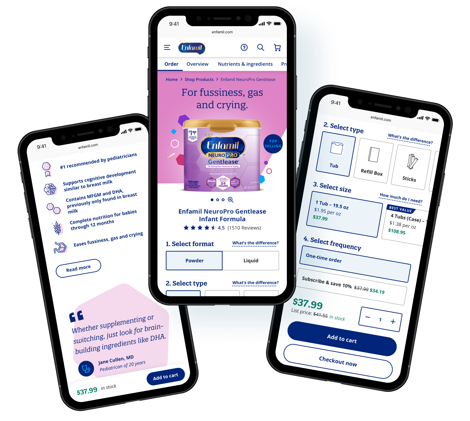

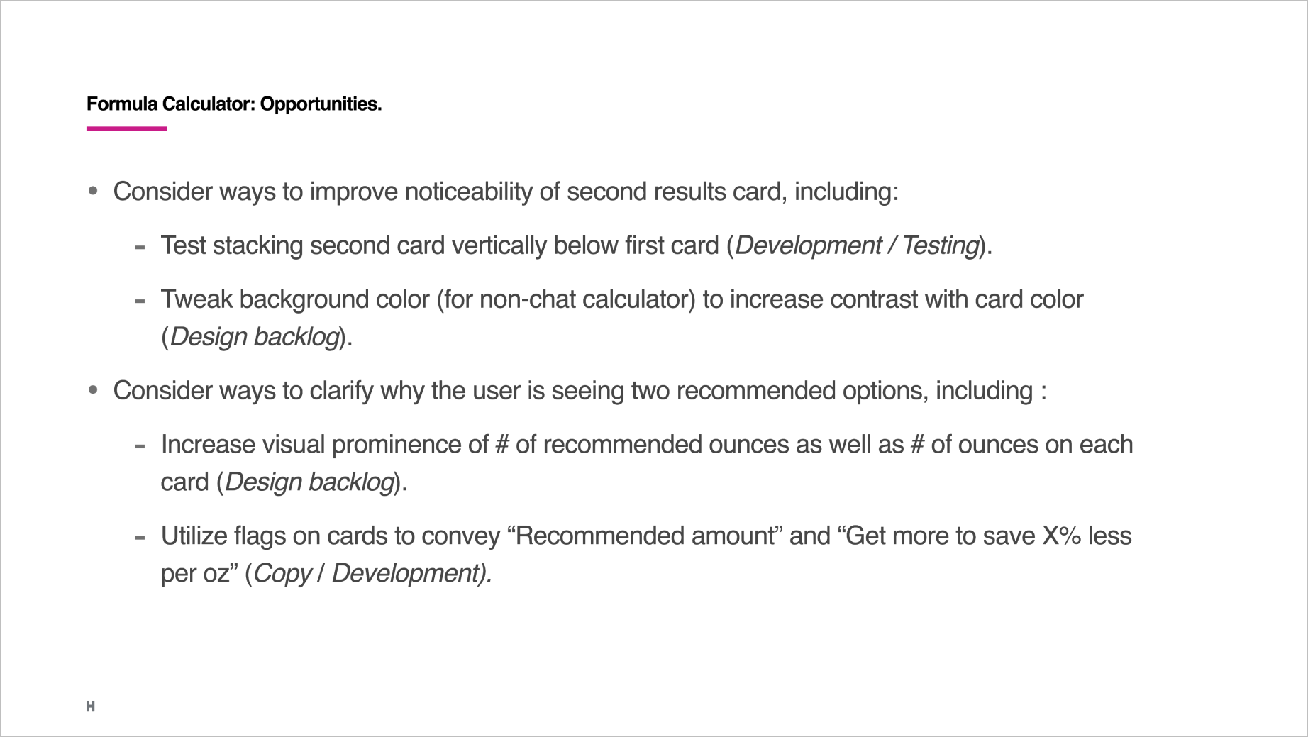
Formula calculator
Answering “How much do I need?”
User research revealed that some parents struggle with estimating how much formula they’ll need, so we designed a tool that recommends an amount to order based on answers to four questions. Suggestive prompts help users unsure about the details.
ARTICE TEMPLATE
Bite-sized guidance and reassurance
The article template needed to accommodate existing content, while making it easier for busy parents to scan. We therefore incorporated TOC links, listicles, expandable sections, and pull quotes. Suggested articles based on topic and user activity encourage continued browsing.

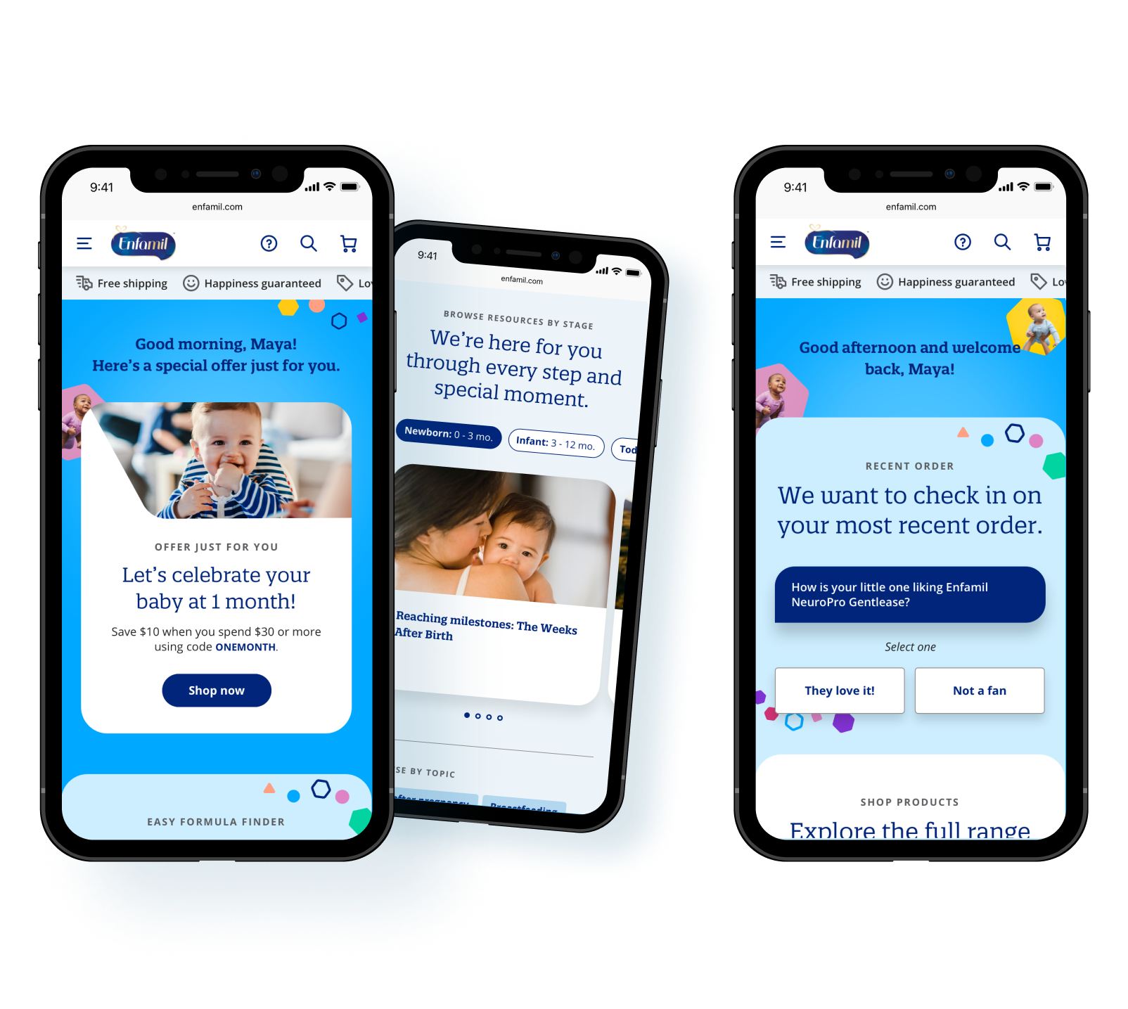
PERSONALIZATION ACROSS PAGES
Providing more value the better we know each user
We used a modular system across the site to adjust module order and content based on user signals. For logged-in users, tailored offers and resources are surfaced, such as articles relevant to their baby's age. For past purchasers, feedback on product experience is gathered, prompting reviews or suggesting alternative formulas based on responses.
03
Process highlights
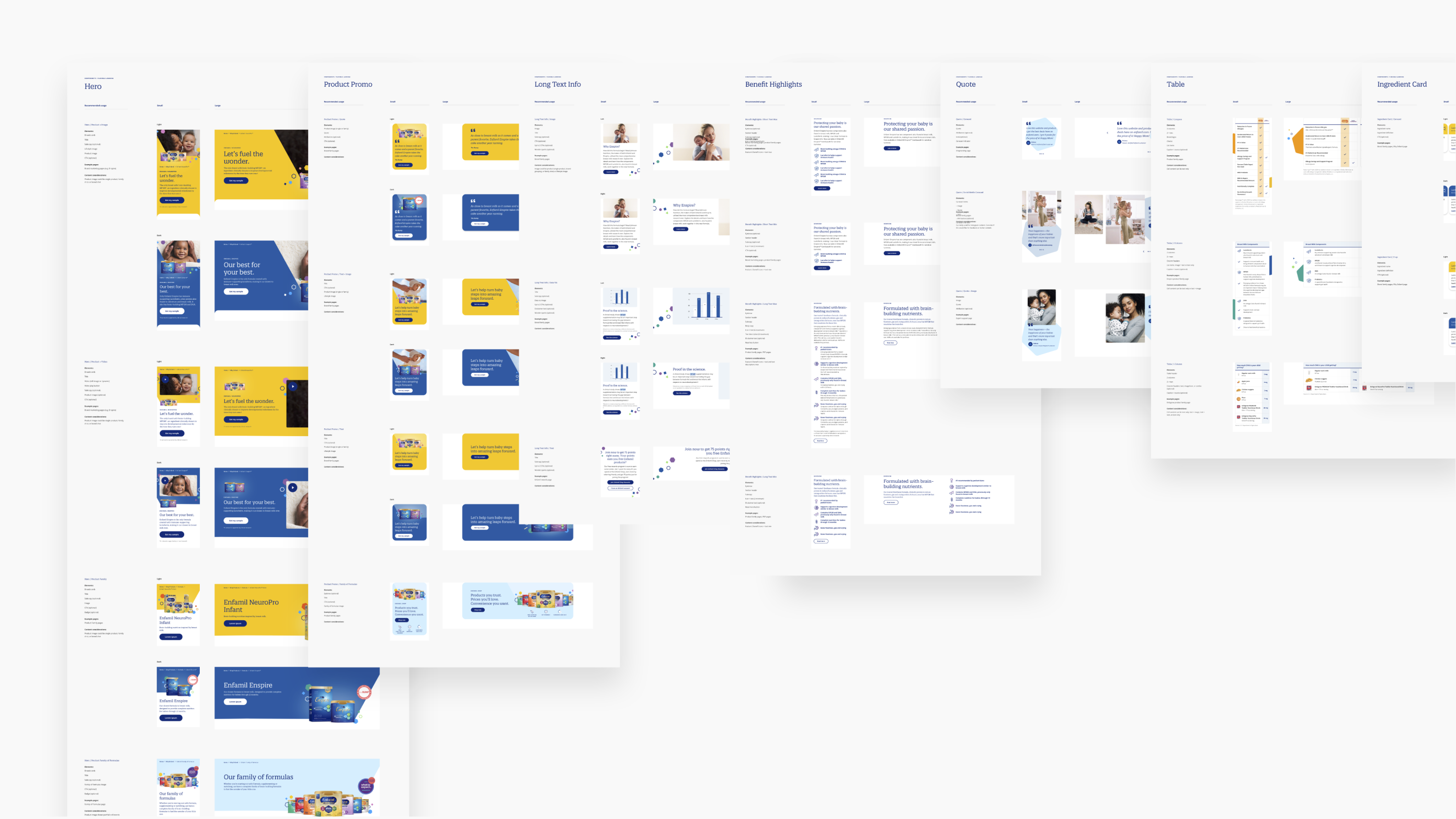
Our design process began with concept design and testing to gauge users’ reaction to our vision. Then came detailed design: 12 responsive page templates, information architecture, and a design styleguide over 5 design sprints. Finally, we conducted usability testing via interactive prototypes to evaluate ease and usefulness.
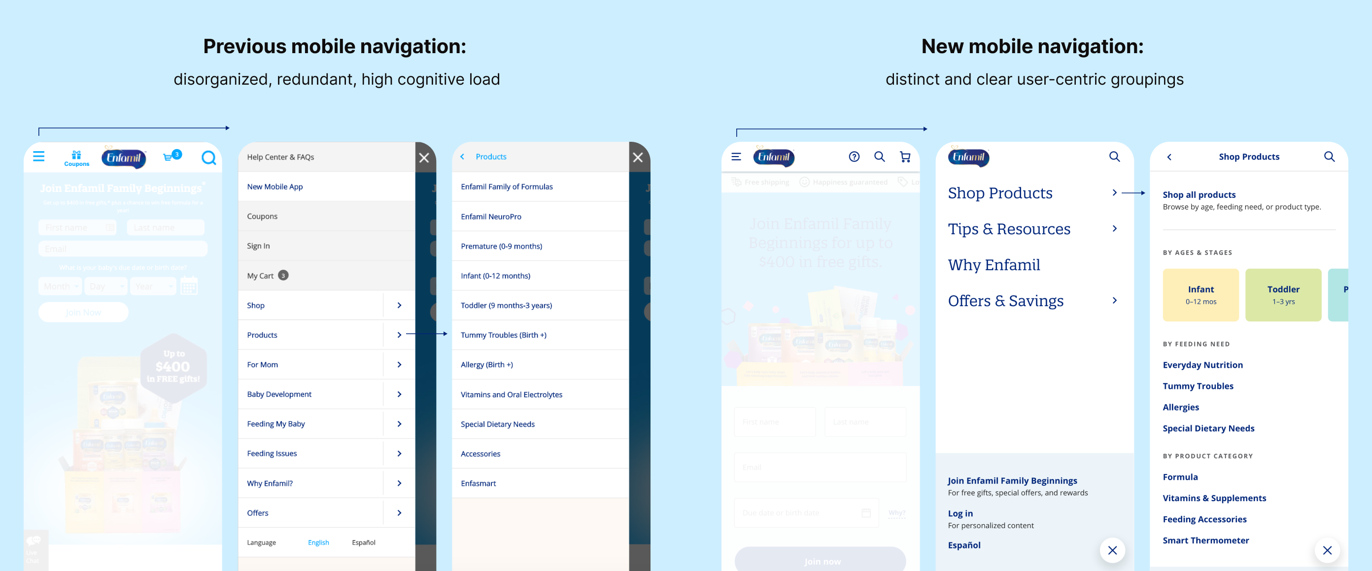
Information Architecture
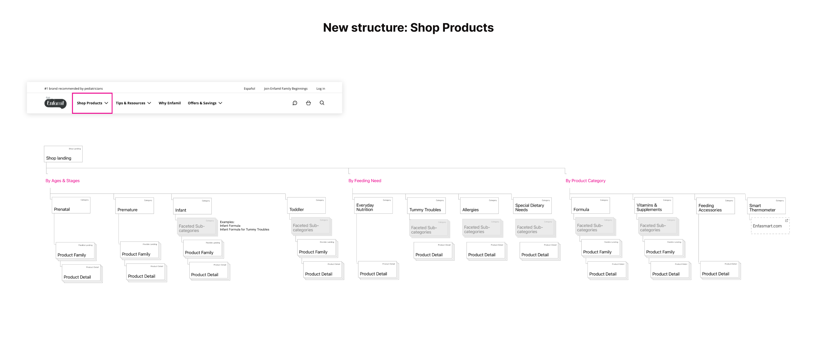
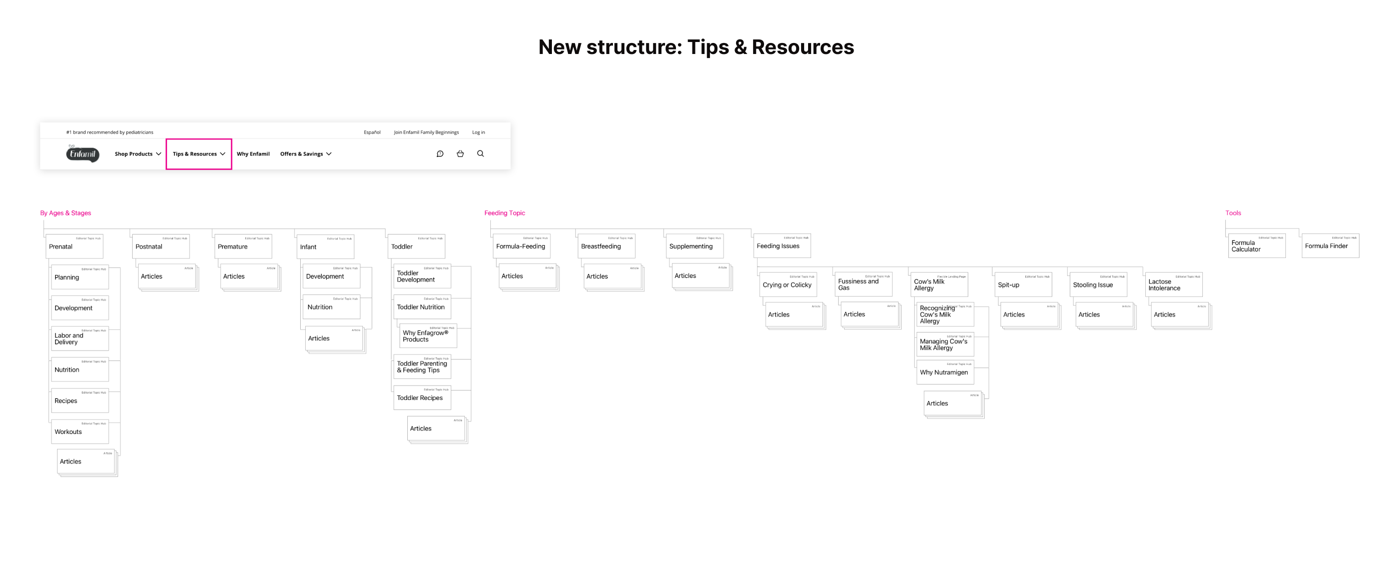
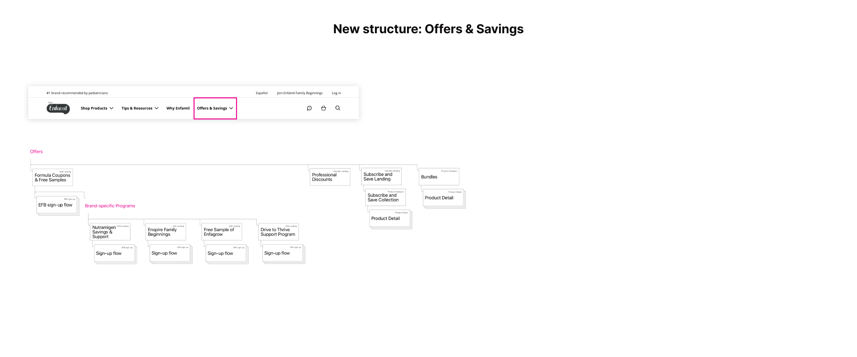
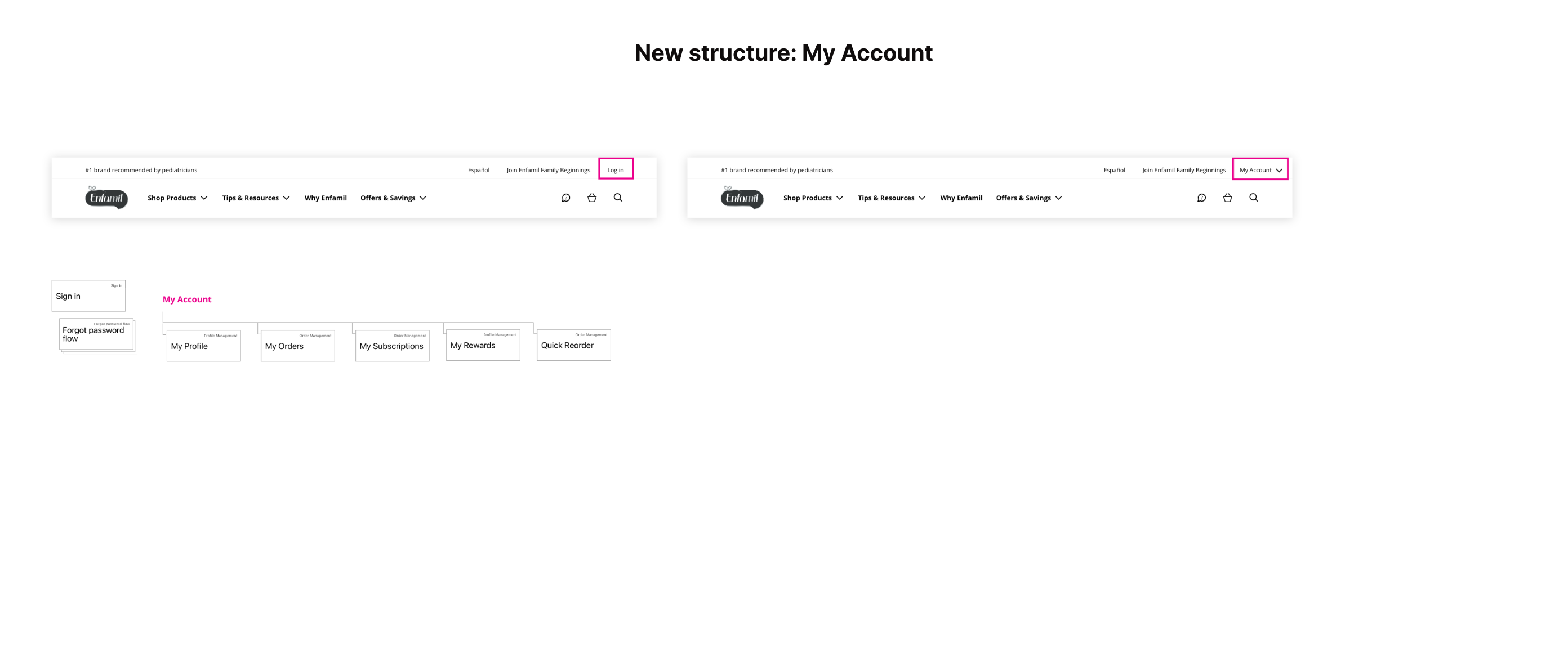
We streamlined the site structure and navigation, leaning on the child’s age and feeding needs as key ways to browse.
We consolidated or removed redundant pages within the site structure, and simplified the navigation to make it more clear what users can do on the site.
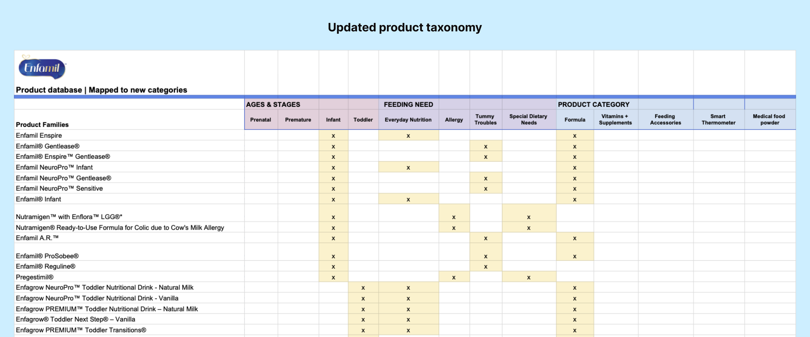
I revamped the product taxonomy, mapping products across 3 “lenses”: Ages & Stages, Feeding Need, and Product Category, for easier browsing based on a parent’s situation. We organized article content in a similar way, knowing from user research that parents valued milestone-based resources.

PERSONALIZATION ARCHITECTURE
To craft a personalized experience, we pinpointed crucial user information, and how the site should adapt accordingly.
Recognizing explicit signals (like loyalty program sign-ups and Formula Finder tool inputs) and implicit ones (like browsing behavior) to infer user information, we identified three key user attributes:
- Child's developmental age or stage
- Feeding context: method (breastfeeding, supplementing, formula feeding) and any related issues (e.g., gassiness)
- Parent's attitude toward formula: gauging openness to formula-related content to avoid misalignment
We then identified personalization opportunities at both template and component levels, including surfacing next best actions, tailoring copy, and re-prioritizing modules within a particular page.
Wireframes: Homepage hero states
A page like the homepage adjusts the order and content of modules based one what’s known about the user
Personalization documentation

I worked with our Product Manager and Data Analyst to document detailed personalization logic
telegraphing shopability & value
Concept testing validated our personalized approach, but illuminated the need to reinforce direct purchase and cost-saving elements.
We learned that some users hesitated to buy formula online unless directly from a manufacturer, like Enfamil. Surprisingly, they hadn’t known they could purchase directly from Enfamil. They also highly valued savings features due to formula's cumulative cost.
In detailed design, we aimed to emphasize e-commerce signifiers, direct manufacturer purchasing benefits, and savings opportunities.
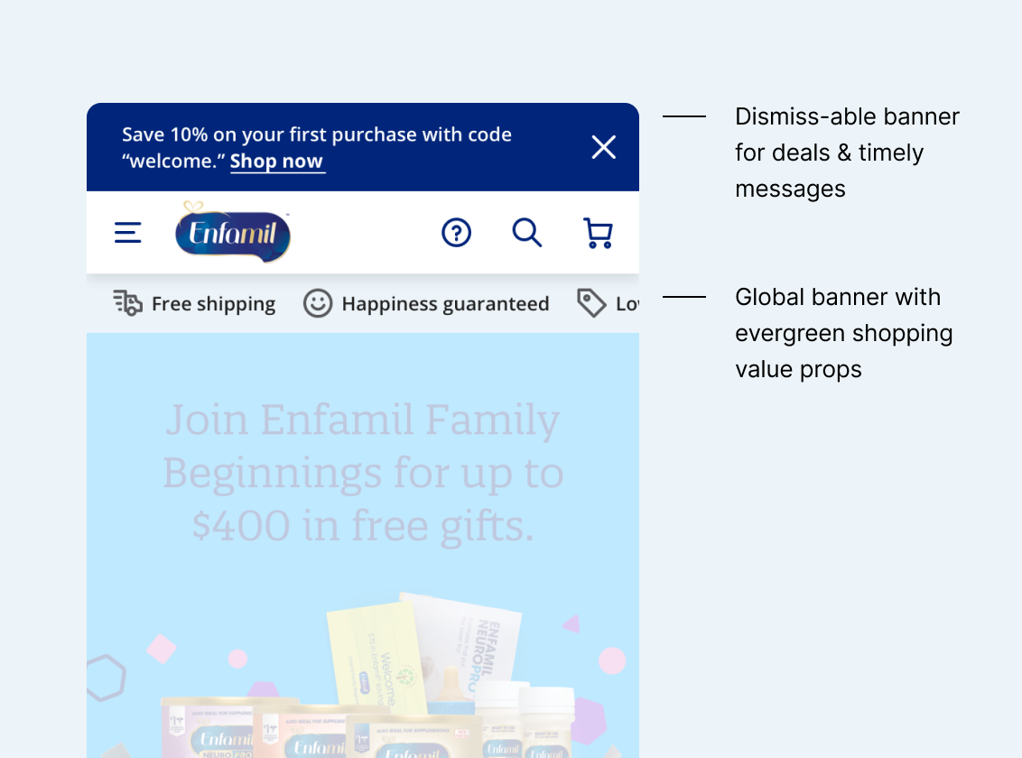
Banner elements highlight shop value props immediately upon entry to the site
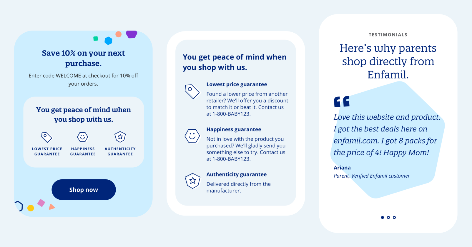
Re-usable modules reinforce shop value props across pages

Usability testing
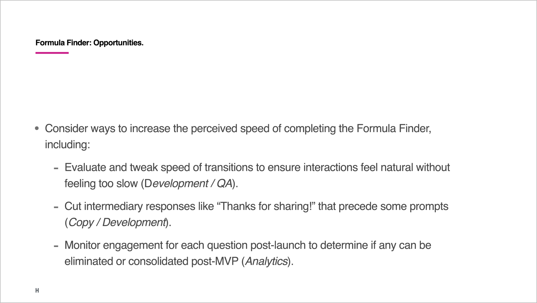
Usability sessions garnered strong, positive feedback overall. We flagged improvement areas and recommended next steps for each feature.
After detailed design, we conducted remote, moderated usability testing with 8 formula-using parents. I collaborated with our Research Lead on planning, leading the creation of interactive Invision prototypes for testing, and translating findings to opportunities.
Feedback was highly positive, with average ratings of 6.6/7 for Ease and 6.4/7 for Usefulness. For each page, we noted improvement opportunities and next steps, from inclusion in the design backlog to copy updates to adjustments during development.


04
Impact
The redesigned website launched in 2020, and Enfamil continues to utilize and evolve the design system we delivered.
12
Responsive page templates
80
Reusable components to be used for any number of future pages
124
Personalization use cases and rules for implementation
♥
Credits: The team at Huge
Creative
Adam Morris - Design Director
Katie Samour - Senior Visual Designer
Sarah Stenseng - UX Lead
Corey Vogel - Copywriter
Emily Wengert - Group VP, UX
Chloe Wong - Senior Art Director
Ziqu Zou - Senior Product Designer
Product, Strategy & Program
Katho Cho - Engagement Director
Karen Hu - Associate Program Director
Mitsy Lopez Baranello - Group VP, Strategy
Fernanda Saboia - Senior Product Manager
Kareen Sarhane - Senior Strategist
Theo Shure - Senior Researcher
Murray Webb - Group Director, Data Science
© 2024 Sarah Stenseng