AccuWeather mobile app redesign
Enabling better planning and decision-making through weather forecasts
Product design • Data visualization • 2019
Activities
UX research
Stakeholder workshops
Information architecture
Wireframing
Prototyping
Usability testing
Outcome
Ranked #2 in weather in App Store
Ranked #3 top grossing in weather in Google Play Store
Creative team @Huge
Sarah Stenseng - UX Lead
Sarah Commet - Copy Lead
Mayck Cuellar - Visual Designer
West Gott - Design Director
Chris Huban - Design Director
Cindy Leong - Sr Product Designer
Virginia Moura - Sr Visual Designer
Chloe Wong - Sr Art Director
the ask
Solidify the dominance of AccuWeather's weather apps via improved UX and differentiation - using their concept designs as a starting point.
AccuWeather had operational issues with their highly rated iOS and Android apps due to legacy tech stacks and inconsistent features across platforms. To unify the experience and keep top rankings, they partnered with Huge to test their initial concept, refine designs, and develop a beta MVP.
Process & role
From concept testing to detailed design to usability testing, I drove our approach to research and feature refinements as UX Lead.
We started with immersion to understand AccuWeather's apps, competitors, and users, and define the product strategy. We iterated on the initial concept and tested two variations with users. I led user research planning with our researcher and identified design implications from our findings.
In design sprints, we finalized 14 screens for development. I oversaw a senior product designer while hands on creating wireframes and prototypes. I planned usability testing and collaborated with product managers and engineers on sprint planning, business requirements, and design feasibility.
01
Defining the strategy
Use Cases
We distilled the needs of 20+ million users into 3 primary use cases.
The AccuWeather app had millions of daily active users across various countries and demographics. In order to design for this broad set of people, we identified key use cases to prioritize in our designs:
- Understand how the weather will impact my routine today
- Plan everyday activities for a specific day/time in the future
- Monitor changes in conditions in real-time to adjust the plan and be prepared
Key User Insight
Scannability of priority information is essential, though access to depth and range of data boosts confidence.
Initial user research showed that users need to make quick decisions about their day, like what to wear or when to leave for work. While they value quick readability of info like temperature and precipitation, breadth and depth of data boosts their confidence in the forecast's accuracy.
Opportunity
Help users understand the weather at-a-glance, while providing the best deep dive for weather details.
Through competitive analysis and stakeholder workshops, we identified AccuWeather’s differentiators: better accuracy and greater specificity. Our strategic opportunity leverages these strengths to address our key user insight.
02
Design process highlights
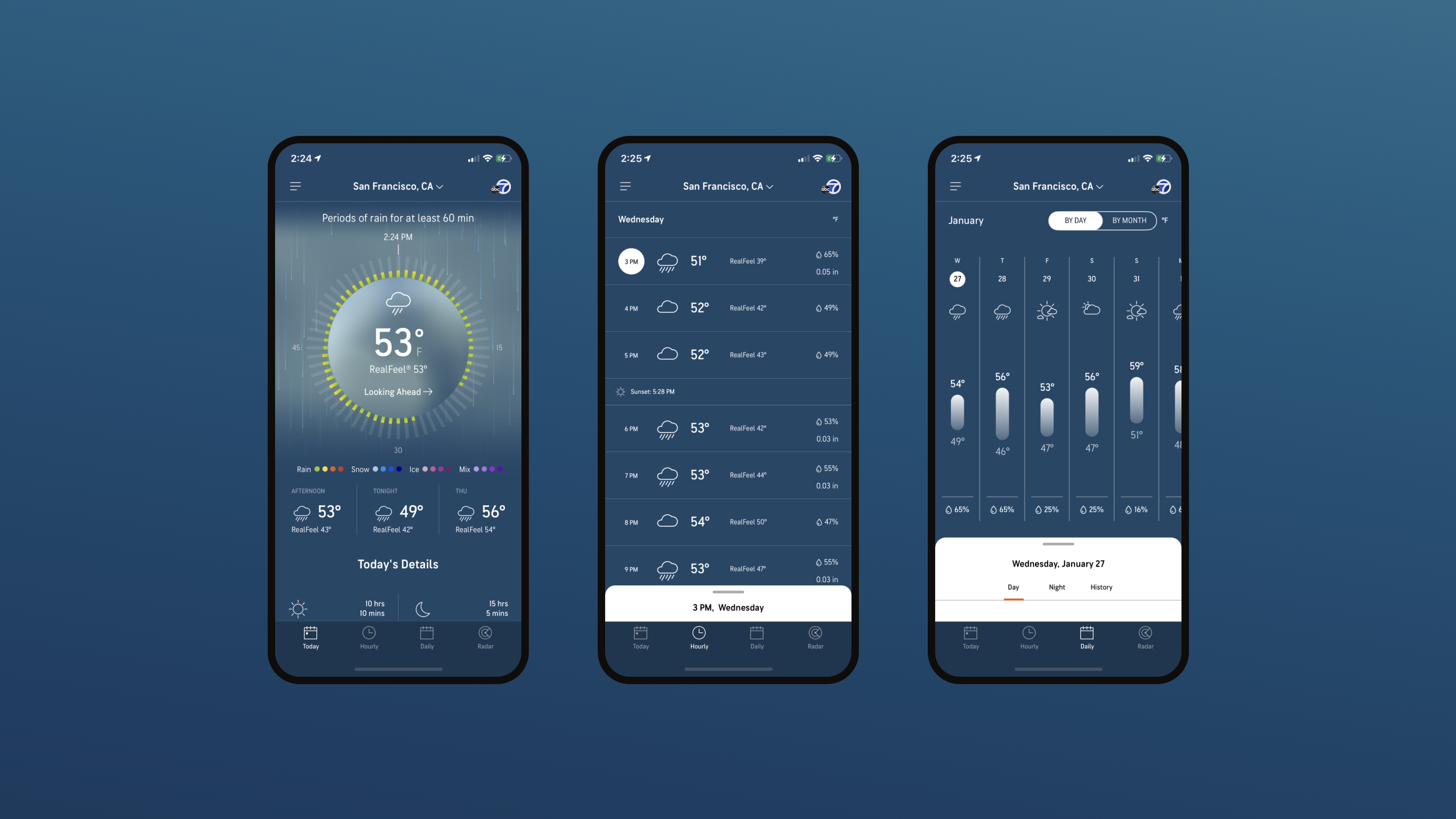
Initial concept & iteration
We workshopped AccuWeather's initial concept, creating two variations for user testing.
The AccuWeather team’s concept elevated existing features believed to have high user and business value. We held a stakeholder workshop to understand design rationale, and identify areas to iterate and test with users.
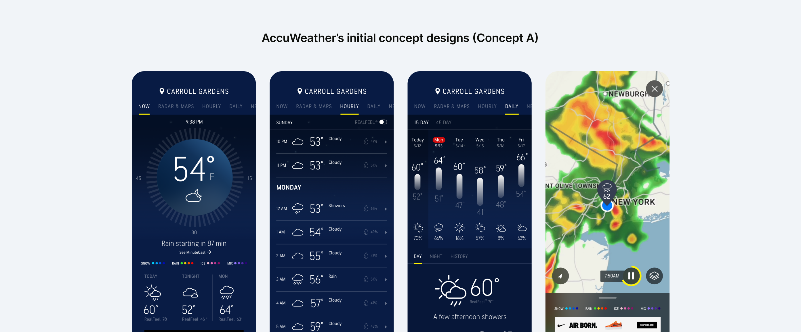
The initial concept utilized a top navigation and relied upon vertical scrolling or expandable sections to access detailed information
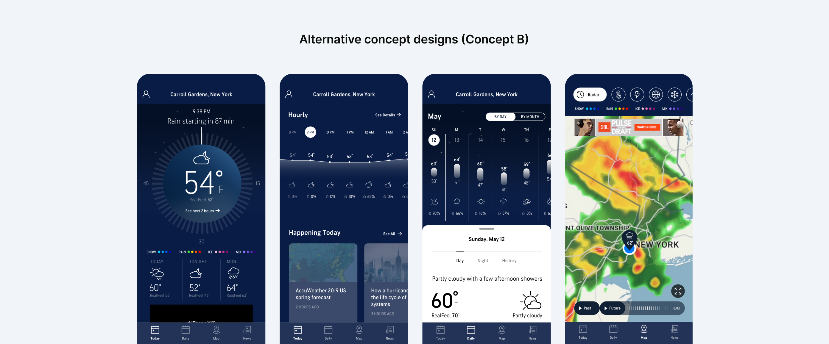
The revised concept explored a bottom navigation, incorporated the "Hourly" forecast as a line graph into the home screen, and utilized an expandable sheet interaction pattern for accessing detailed information.
concept testing to refinement
Findings from concept testing informed key feature refinements during design sprints.
I collaborated with our researcher on a test plan, and tailored clickable prototypes to identify potential usage barriers. We conducted remote interviews with 14 US-based users, primed with next-day and same-day planning scenarios to test both prototypes.
For screens tested in our research, each design sprint started with revisiting testing learnings, iterating, selecting the top approach, prototyping, and finalizing visual designs.

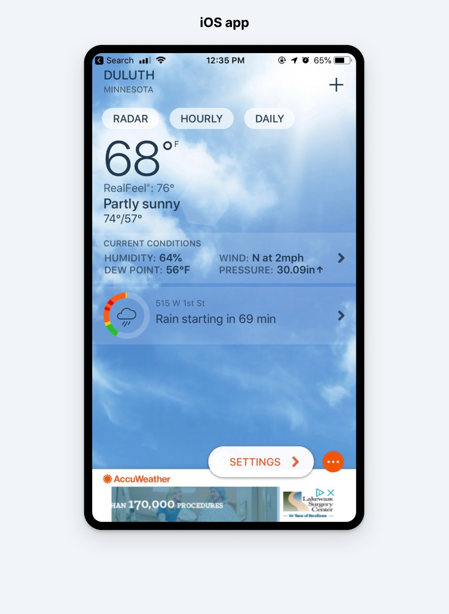
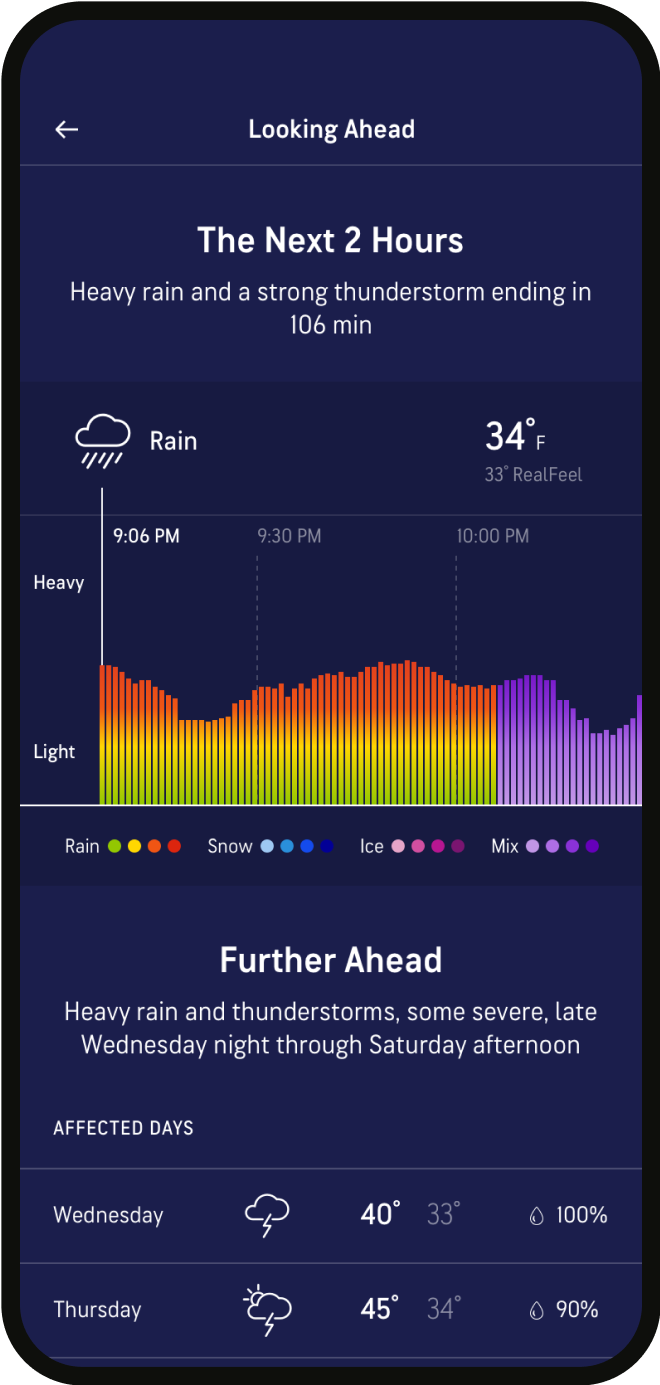
MinuteCast feature
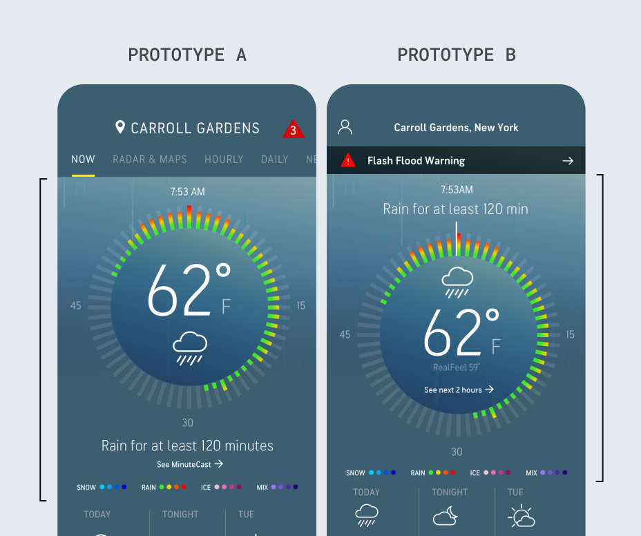
Learnings: The feature on the home screen was a user favorite, with some room to improve speed of comprehension.
Iterations: We explored a range of tweaks to labeling, data visualization, and typography.

Refined designs: We shifted the summarizing statement to the top to introduce the module, ensuring clear info hierarchy.
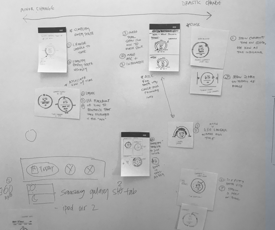
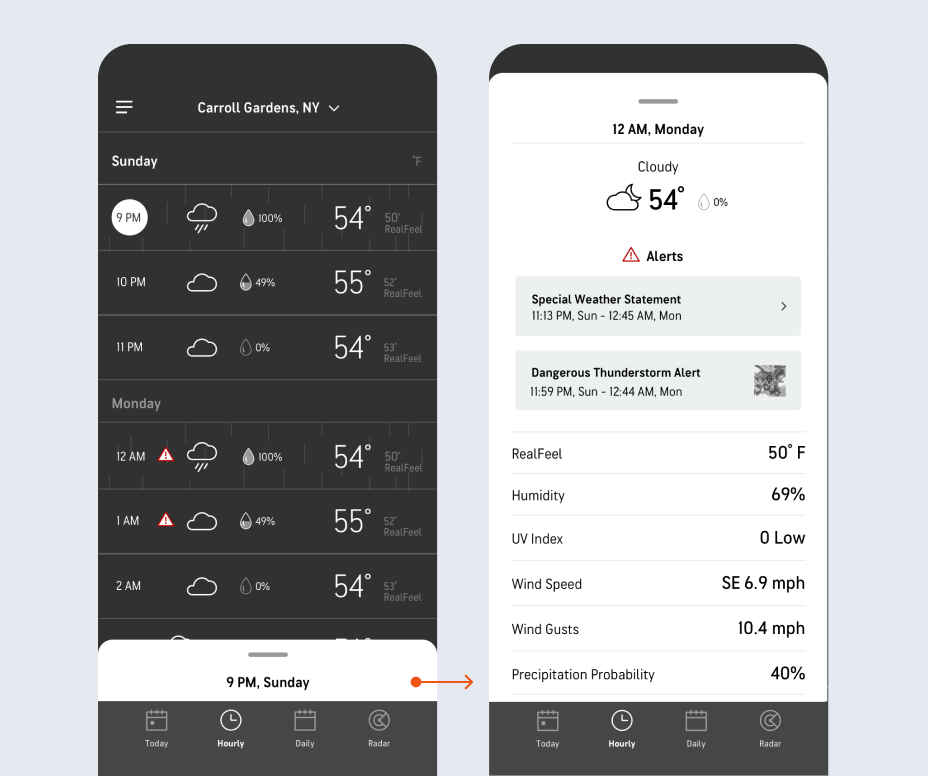
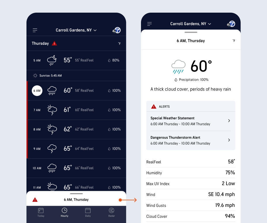
Radar screen
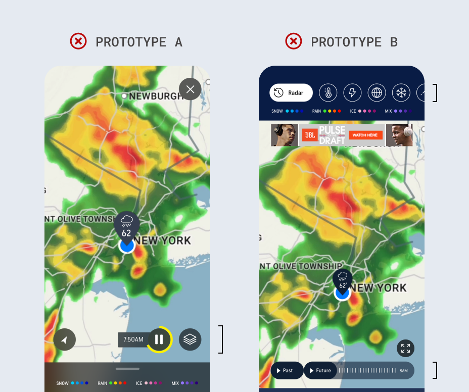
Learnings: Users expressed confusion about how to view current time within the radar screen, and meanings behind iconography across both prototypes.
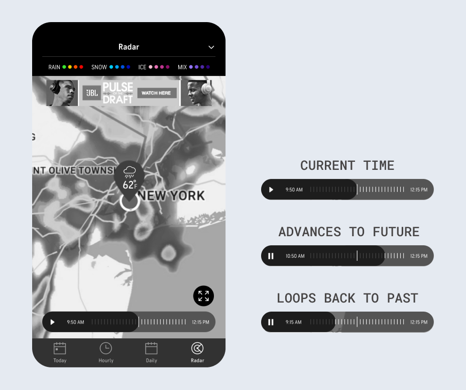
Iterations: Focused on defining states for a linear timeline UI combing "past" and "future" views, and clarifying affordance to view map layers.
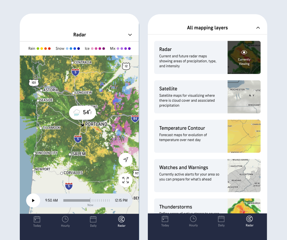
Refined designs: The final timeline UI seamlessly combines “past” and “future” views, with current time clearly labelled. Map layers are accessed via a drawer at top of the screen.
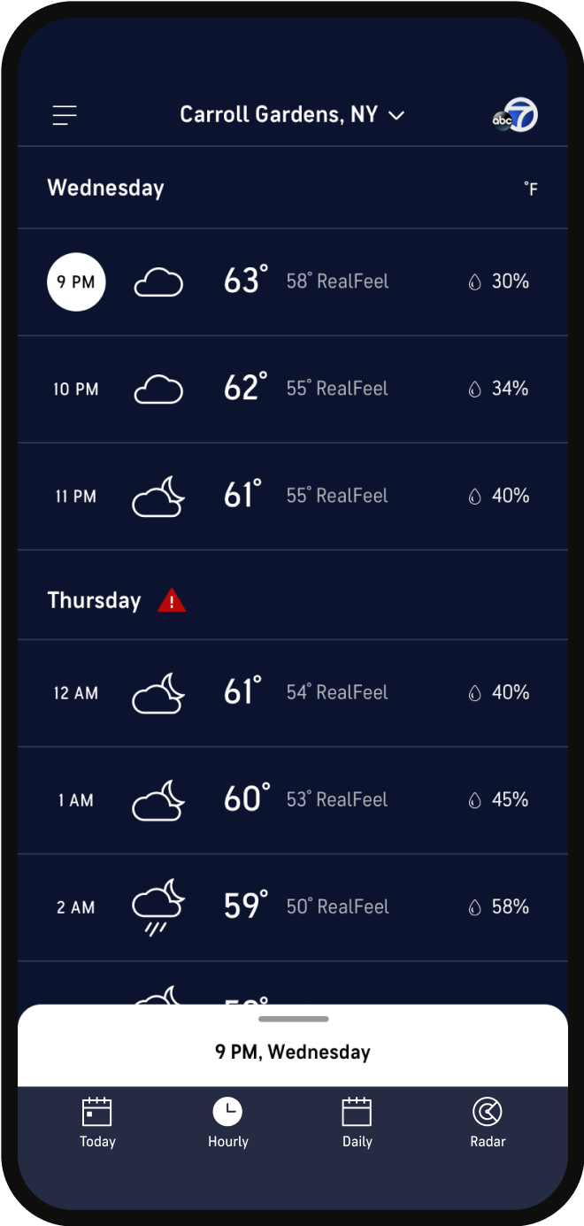
Hourly forecast
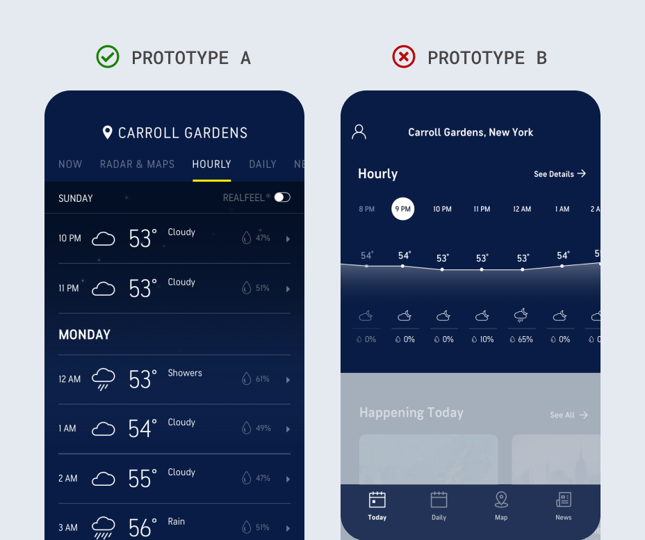
Learnings: Including Hourly forecast in the navigation in prototype A (vs module on home screen on prototype B) increased findability, and list format was preferred to a graph format.
Iterations: We built off of prototype A’s list format, exploring prioritization of data and ways to enable expansion of more information
Refined designs: We optimized the list format for readability, and established a tappable / swipe-able sheet for showing details for each hour.
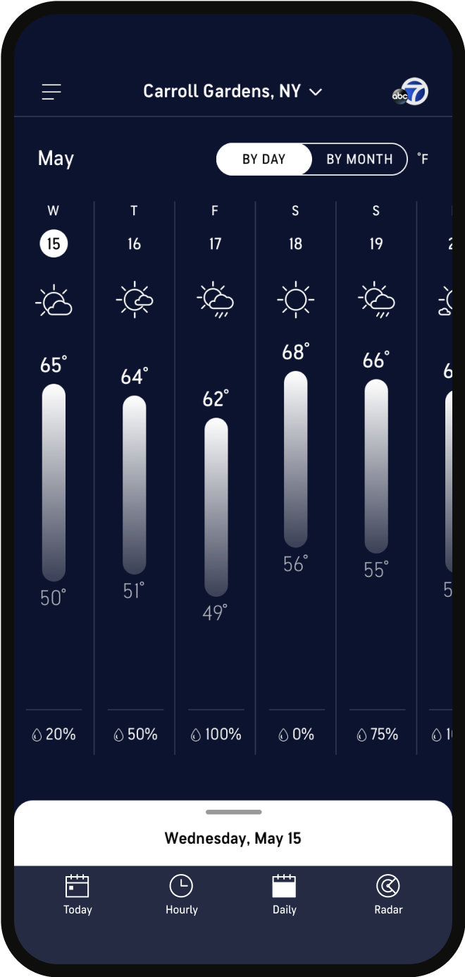
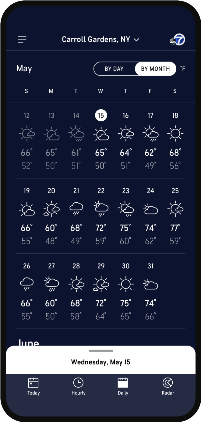
Daily forecast
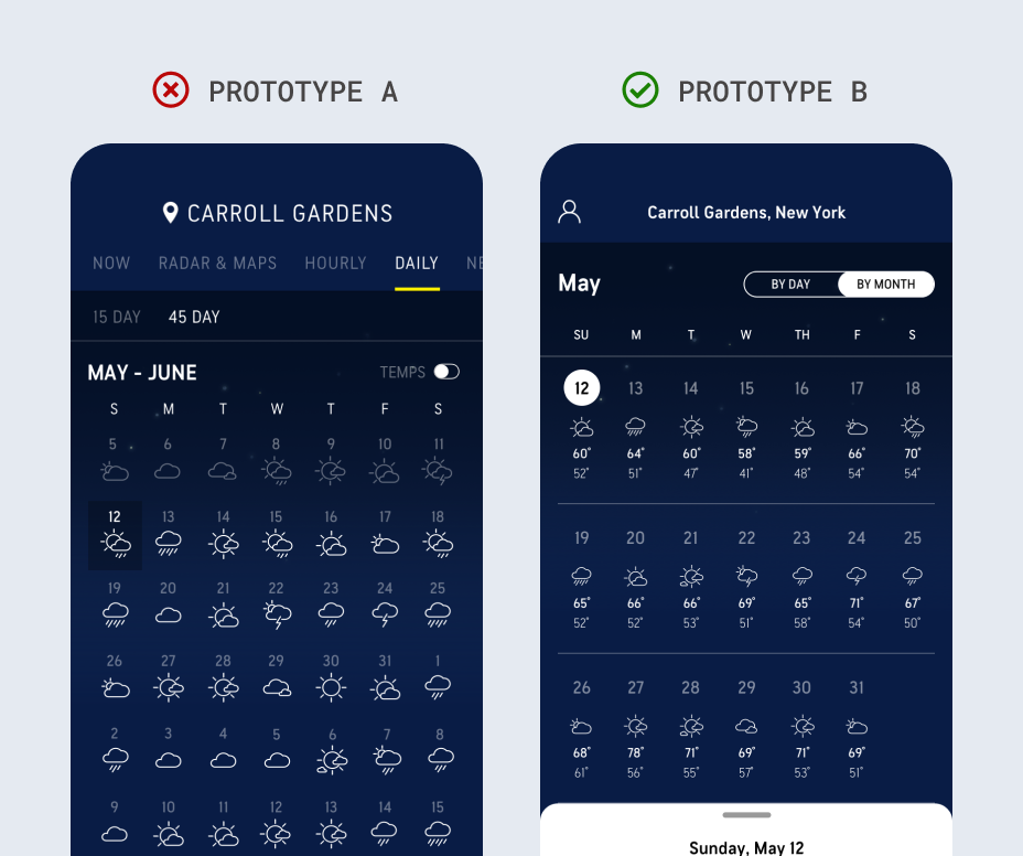
Learnings: Including temperature highs and lows in 45 Day forecast (as in prototype B) made it more useful to users.
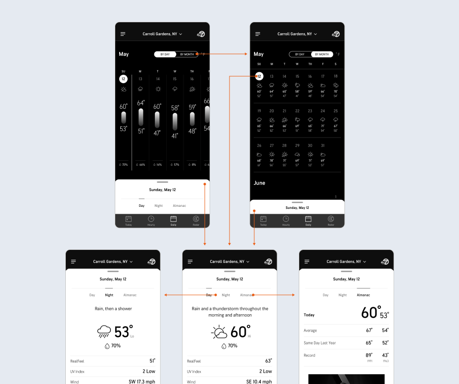
Iterations: We built off of prototype B, defining interaction models to shift between 45 day and 15 day forecast, and ways to enable expansion of more information.
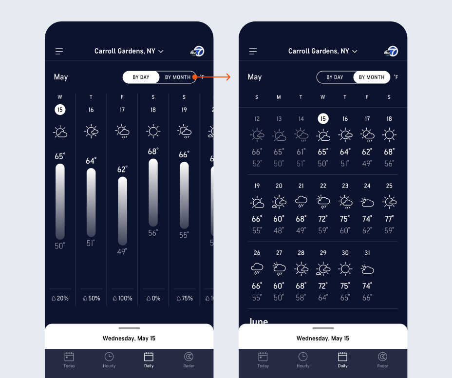
Refined designs: We updated the typographic treatment to ensure readability, with a swipe-able sheet showing details for each day.
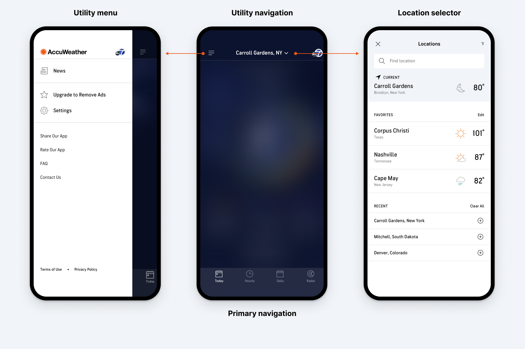
Information architecture
We updated the navigation to provide clear hierarchy and organizaiton.
Navigation confusion, especially on iOS, was a problem in the existing app. To address this, we created greater visual distinction between the navigation and screen content, and placed the "location selector" and utility menu within a single top navigation bar for easier access and visibility.
Before
After
data visualizations
Wireframing and prototyping helped us design new data visualizations for quick understanding.
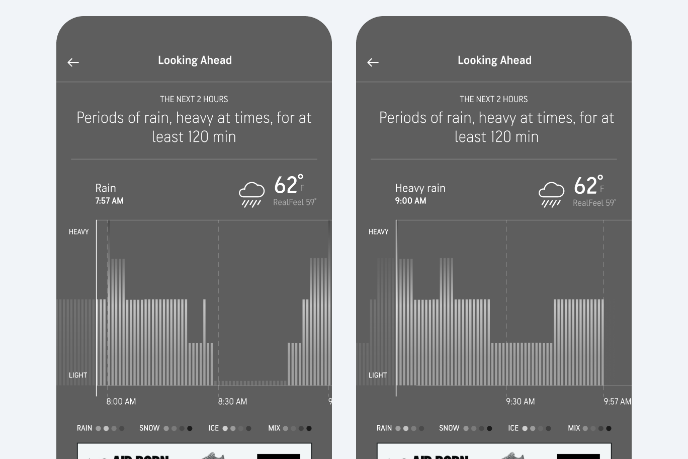
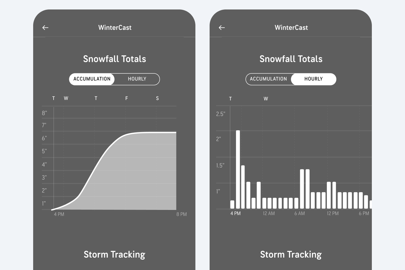
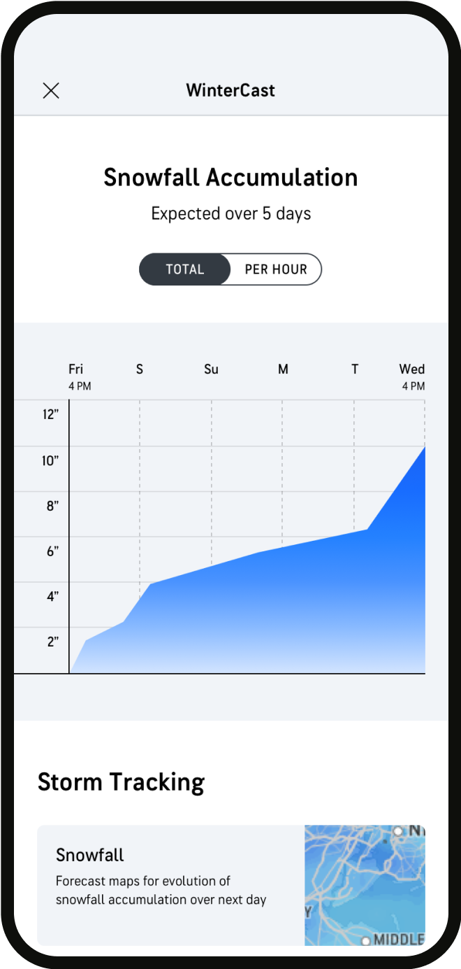
Not all screens underwent initial user testing, including two new screens with interactive data visualizations: MinuteCast Detail, showing minute-by-minute precipitation levels for two hours, and WinterCast, detailing snowfall amounts over time. Wireframing helped us define:
- What graph treatments and axis labeling will help users grasp information most quickly?
- How might we enable users to scroll through a linear graph?
- How should the design flex depending upon duration or type of weather event?
MinuteCast Detail wireframes
WinterCast wireframes
balancing Ux & business impacts
I collaborated on a model to estimate ad revenue, informing UX decisions about ad placement.
Ads were a primary revenue source, making their placement and sizing crucial. I worked with our strategy director on a spreadsheet to estimate revenue impacts of our proposed ad treatments.

Actual values removed for confidentiality
03
Introducing the AccuWeather MVP app
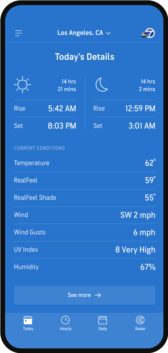
Home Screen
An immediate, visual snapshot of current and upcoming conditions upon opening the app
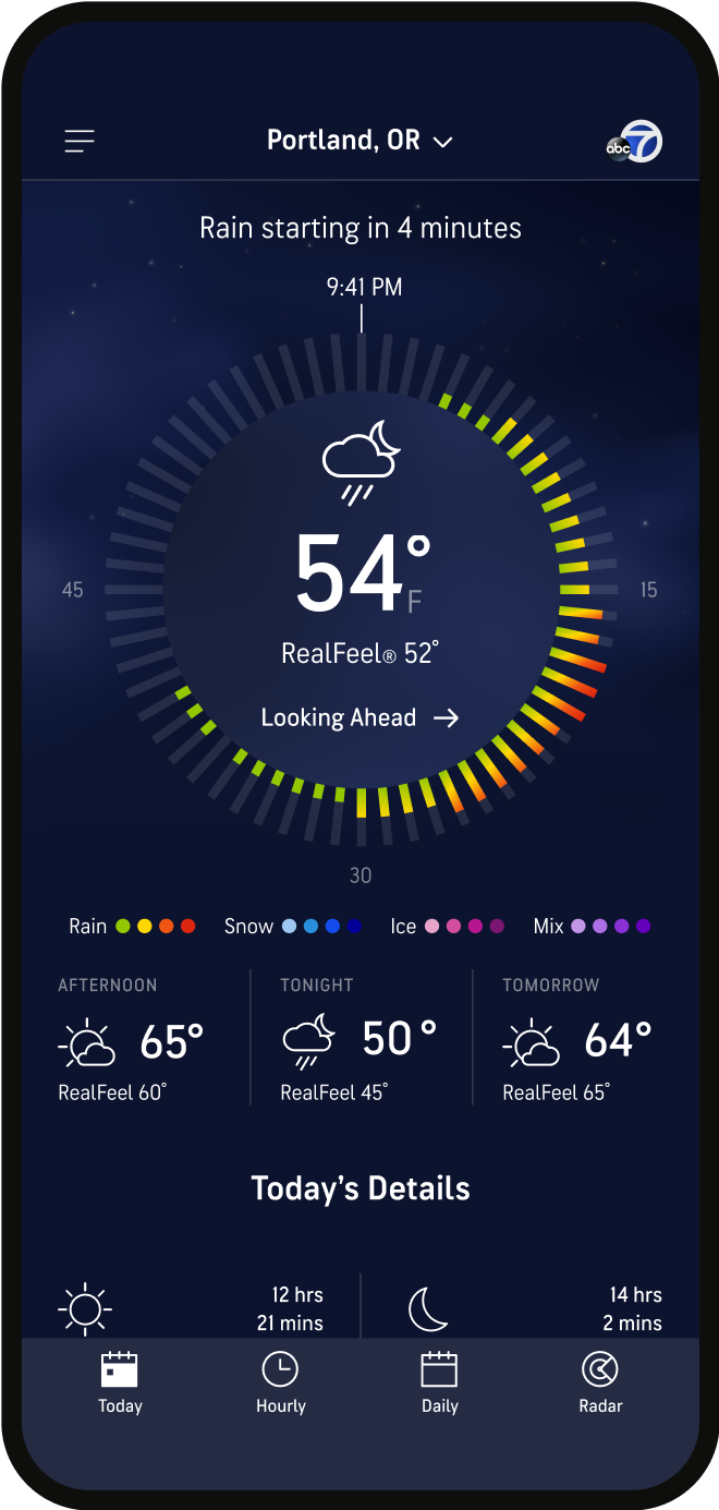
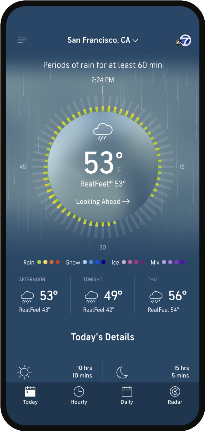
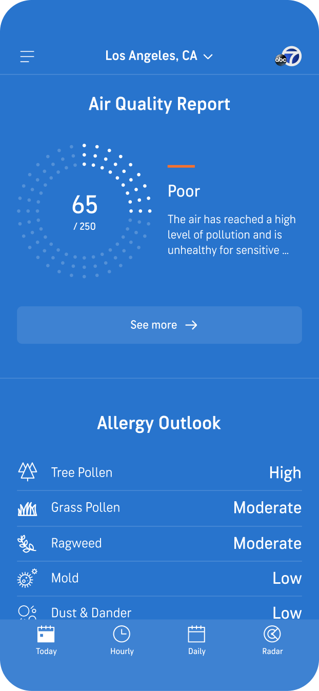
Home Screen
A holistic view of the day, including air quality, allergen info, and news updates
Minutecast detail
Down-to-the-minute, interactive predictions, helping users plan with precision
HOURLY FORECAST
A scannable hourly timeline with quick access to details, including relevant weather alerts

daily forecast
Calendar views conveying weather for the week or the month at a glance
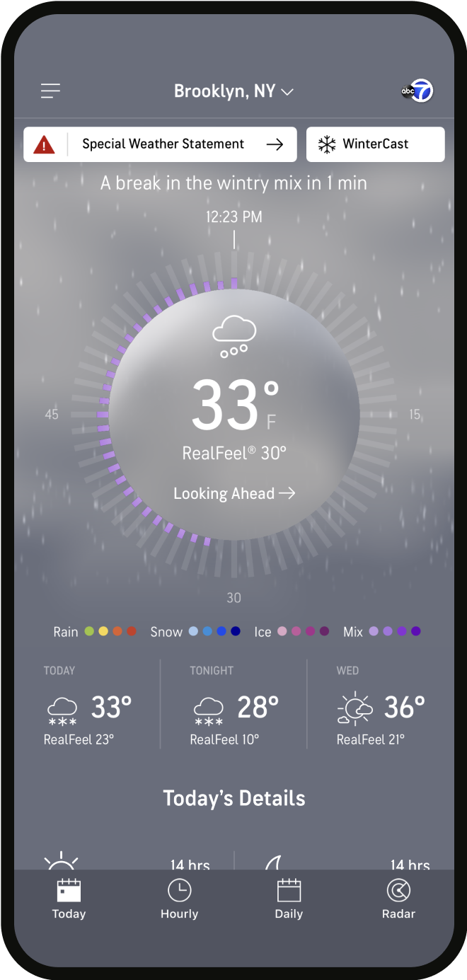
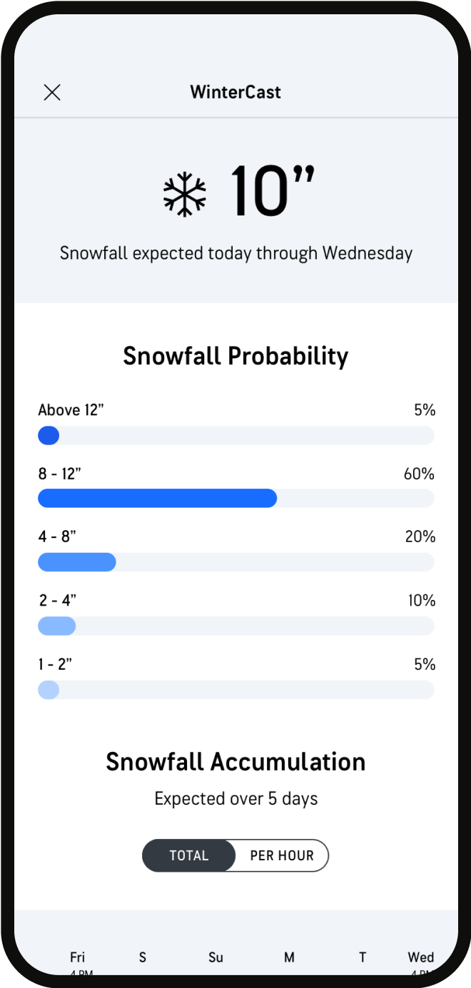
Wintercast
Everything users need to know to prep for an upcoming snowstorm
04
Usability testing & post-MVP recommendations
We conducted two rounds of unmoderated usability testing via Usertesting.com with 8 participants using clickable prototypes. Overall, users comprehended the content and completed tasks, with some post-MVP enhancement opportunities identified.
Learnings for future releases
Home screen: Overall comprehension was strong. Future enhancement opportunity to update the treatment of the Air Quality module to improve comprehension.
Radar: Users successfully performed all tasks within this screen. Future enhancement opportunity to allow map layers to be reordered according to user preferences.
WinterCast: This screen received very high usefulness ratings, with many participants saying they found it more useful than expected. Future enhancement opportunity to communicate “snow on the ground” as additional data.
Settings: Participants successfully navigated to and understood the functionality within this screen. Future enhancement opportunity to enable more granular control of notifications per location.
Location Selector: All participants were successful in searching for an viewing a new location from the app’s home screen.
05
Impact
Ranked #2 in Weather in the app store, #3 “top grossing” in Weather in the Google Play store
The app had a beta launch, followed by a full relase in July 2020. The AccuWeather team has continued to iterate and add features based on user feedback. The app garnered top honors from The World Meteorological Organization’s 2020 International Weather App Awards:
- Best User Interface and Data Representation
- Best Design Presentation of Information, User-Friendliness; Access and Customization
♥
Credits: the team at Huge
Creative
Sarah Commet - Copy Lead
Mayck Cuellar - Visual Designer
West Gott - Design Director
Chris Huban - Design Director
Cindy Leong - Senior Product Designer
Virginia Moura - Senior Visual Designer
Sarah Stenseng - UX Lead
Chloe Wong - Senior Art Director
Product, Research, Tech
Paul Farina - Technical Director
Francisco Gutierrez - Senior Engineer
Matt Lisowski - Director, Product
Amar Mehta - Senior Product Manager
Diane Mun - Research Lead
Andre Souza - Director, Business Strategy
Katie Sexton - Technical Architect
© 2024 Sarah Stenseng